-
Notifications
You must be signed in to change notification settings - Fork 11
feat: show selected item's icon in trigger label if applicable #884
New issue
Have a question about this project? Sign up for a free GitHub account to open an issue and contact its maintainers and the community.
By clicking “Sign up for GitHub”, you agree to our terms of service and privacy statement. We’ll occasionally send you account related emails.
Already on GitHub? Sign in to your account
Conversation
Codecov Report
@@           Coverage Diff           @@
##             main     #884   +/-   ##
=======================================
  Coverage   85.35%   85.35%
=======================================
  Files         801      801
  Lines       16466    16468    +2
  Branches     2066     2067    +1
=======================================
+ Hits        14055    14057    +2
  Misses       2379     2379
  Partials       32       32
Continue to review full report at Codecov.
|
This comment has been minimized.
This comment has been minimized.
This comment has been minimized.
This comment has been minimized.
This comment has been minimized.
This comment has been minimized.
| selectedOption: SelectOptionComponent<V> | undefined, | ||
| triggerIcon: string | undefined | ||
| ): string | undefined { | ||
| if (selectedOption !== undefined && selectedOption?.icon !== undefined) { |
There was a problem hiding this comment.
Choose a reason for hiding this comment
The reason will be displayed to describe this comment to others. Learn more.
So we're favoring the selections icon in the trigger over the trigger's icon? that doesn't seem right to me, but I guess I'd also find it strange to use a trigger icon and individual icons together
There was a problem hiding this comment.
Choose a reason for hiding this comment
The reason will be displayed to describe this comment to others. Learn more.
(also, unnecessary first condition)
| if (selectedOption !== undefined && selectedOption?.icon !== undefined) { | |
| if (selectedOption?.icon !== undefined) { |
There was a problem hiding this comment.
Choose a reason for hiding this comment
The reason will be displayed to describe this comment to others. Learn more.
if there's a selection, we should show the selection's icon or nothing.
If there's no selection, show the trigger icon. That's the intent.
It doesn't make sense to show the regular trigger icon along with a selection. that would be confusing.
we already show selected label in the trigger the same way. This is extending it to the icon as well.
Fixed the logic.
There was a problem hiding this comment.
Choose a reason for hiding this comment
The reason will be displayed to describe this comment to others. Learn more.
I think my brain wasn't functioning last night when I wrote the logic for this. 🤔
There was a problem hiding this comment.
Choose a reason for hiding this comment
The reason will be displayed to describe this comment to others. Learn more.
Using the selected icon if defined makes sense, but not using the component wide icon if the selections aren't individually... iconized breaks the original intent. I think it's just two different styles:

in this one, that icon just is meant to apply to every option, but not appear as a duplicate in the option list.
There was a problem hiding this comment.
Choose a reason for hiding this comment
The reason will be displayed to describe this comment to others. Learn more.
updated
This comment has been minimized.
This comment has been minimized.
This comment has been minimized.
This comment has been minimized.
This comment has been minimized.
This comment has been minimized.
This comment has been minimized.
This comment has been minimized.
This comment has been minimized.
This comment has been minimized.
This comment has been minimized.
This comment has been minimized.
| spectator.tick(); | ||
|
|
||
| // No selection -> select component level icon and no color | ||
| expect(spectator.debugElement.query(By.css('.trigger-prefix-icon')).componentInstance.icon).toBe( |
There was a problem hiding this comment.
Choose a reason for hiding this comment
The reason will be displayed to describe this comment to others. Learn more.
is there a reason to use debug element querying rather than spectator querying ? is it because spectator doesn't give you access to the component on root queries?
There was a problem hiding this comment.
Choose a reason for hiding this comment
The reason will be displayed to describe this comment to others. Learn more.
yep. wanted to access component to verify the contents of it.
| 'select-level-icon' | ||
| ); | ||
| // tslint:disable-next-line:no-null-keyword | ||
| expect(spectator.debugElement.query(By.css('.trigger-prefix-icon')).componentInstance.color).toBe(null); |
There was a problem hiding this comment.
Choose a reason for hiding this comment
The reason will be displayed to describe this comment to others. Learn more.
nit: toBeNull() (avoids the tslint disable)
Description
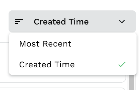
show selected item's icon in trigger label if applicable
Testing
Manually verified. UT added.
Checklist: